Improving the tools behind customer support at Voltex Electrical
As the first UX lead at Voltex Electrical, I sat with the customer support and sales staff who used the company's ERP all day. The research showed how much its speed was slowing them down, and how hard it was to get help when it failed. That led to platform performance work and a new IT Service Desk, designed for both staff and the IT team.
- Role
- Lead UX and craft lead, the first in the organisation. Joined as a senior UX designer, then expanded into leading research and wider UX operations. On this work: contextual inquiry, Service Desk UI design, usability testing and the post-launch survey
- Team
- 1 PM, 2 ERP platform developers and 1 Microsoft developer, with customer support, sales and IT
- Company
- Voltex Electrical
- Timeline
- August 2024 to November 2025
- Outcome
- Research with five staff put evidence behind long-standing complaints about the ERP, and platform speed and stability became a priority. Downtime went from once a week to zero in the first month. A second finding led to the IT Service Desk, which launched to high CSAT. Both supported operational excellence, one of the company's pillar goals for 2025.
Act 1 · 2024: Internal tools research
Context
At Voltex Electrical, customer support, sales and warehouse operations all worked in the company's ERP. Customer support and sales handled orders, returns and warranty claims across phone, live chat and SMS, and nearly all of it ran through the ERP. One customer support agent took up to 30 inbound calls a day.
A recent upgrade had made the system slower, and the keyboard shortcuts staff relied on stopped working. On the phones, small delays added up across hundreds of calls a week, each one with a customer waiting.
Contextual inquiry
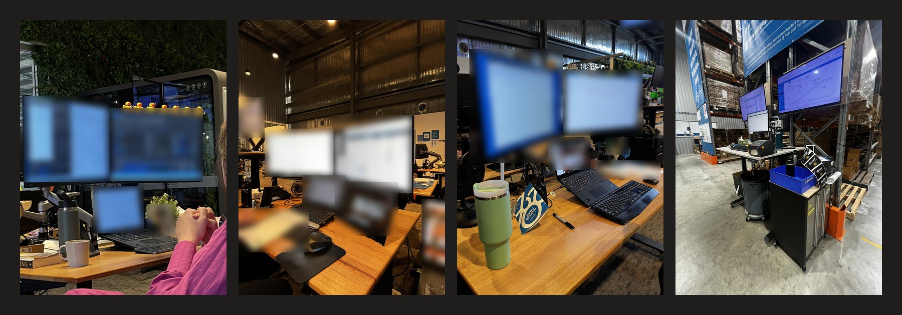
Over two weeks, I observed staff from customer support, operations and the warehouse at their desks during real shifts, and asked questions as they worked, so I could see their workarounds as well as hear about them. Five took part in the structured sessions: four customer support agents on inbound calls and chat, and one outbound sales rep.
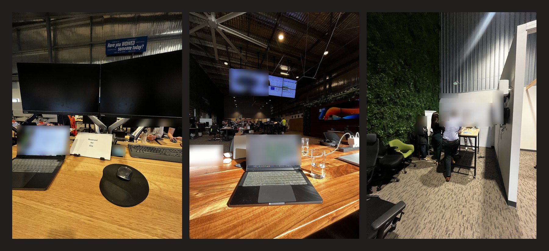
I used a guide of 13 questions, each paired with what it was meant to reveal, to keep the sessions consistent. It started with a typical day and the features they used and avoided, then moved to the last error they hit and how they got past it. I also gathered the error reports staff had logged since August 2024.
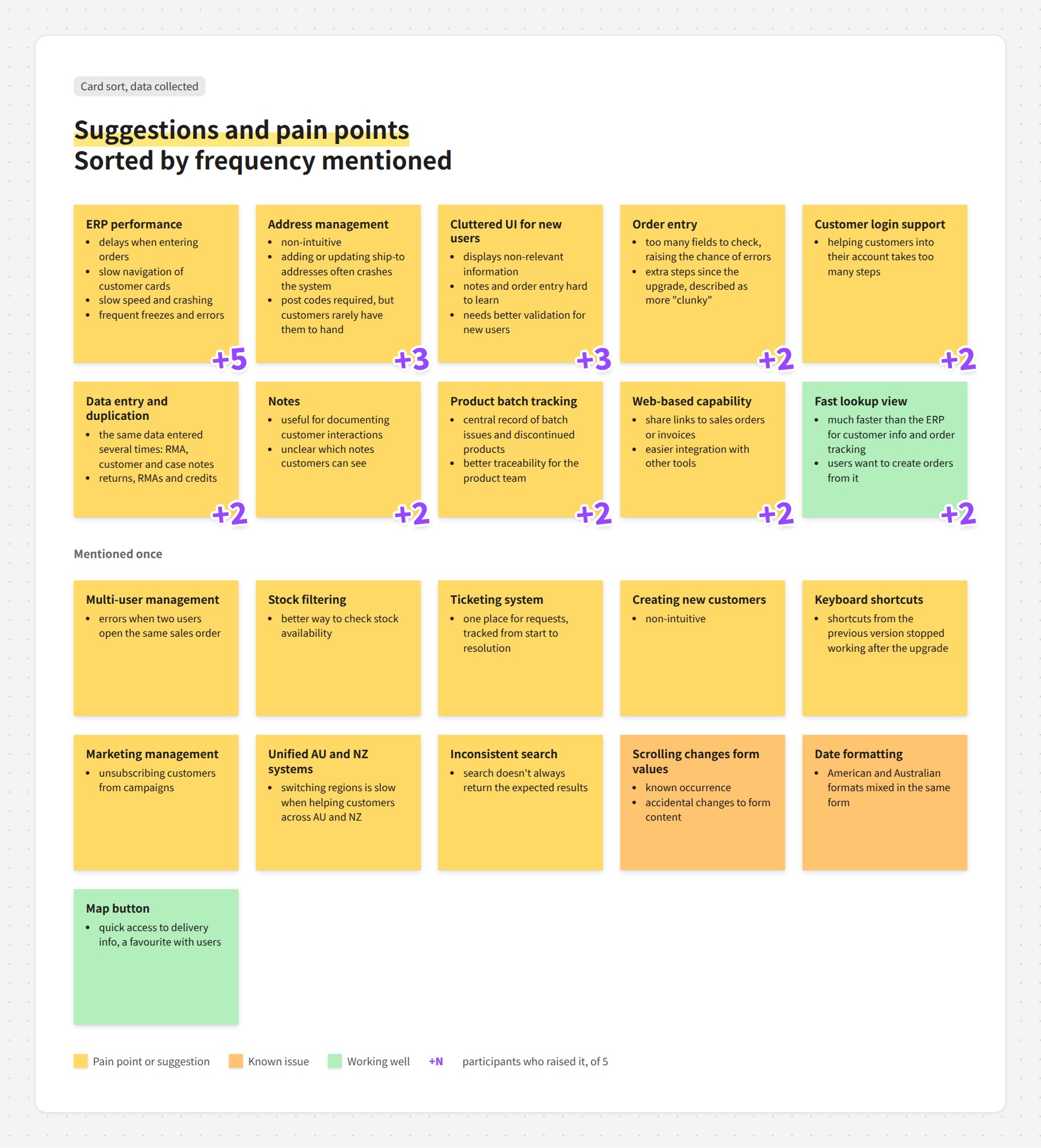
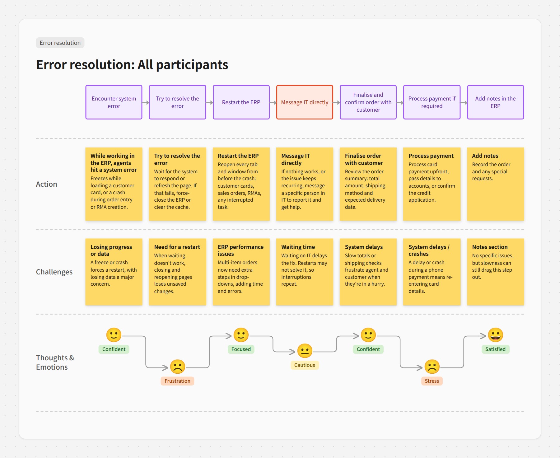
From the sessions I identified 11 workflows and ranked them by how often they came up. Six became journey maps showing the actions, challenges and emotions at each step.
Key insights
All five named speed first. Slow order entry and customer cards were a daily frustration, and a crash mid-call meant starting an order again with the customer still on the line.
Address entry and duplicate notes caused the most rework. Adding a shipping address often froze the system. RMA, customer and case notes lived in separate places, and staff couldn't tell which ones customers could see.
Getting help depended on knowing who to message. When a restart didn't fix an error, staff messaged a specific person in IT and waited. Requests lived in private chats and group channels, with no record and no way to see whether anyone had picked them up. One participant asked for a ticketing system to track issues from start to finish.
Making the case for speed
The research put evidence behind those complaints: pain points ranked by how many people raised them, journey maps showing where delays and crashes hit mid-call, and the error reports logged since August 2024.
That gave the product team the evidence to make platform speed and stability a priority. The two ERP platform developers took on the performance work.
Act 2 · 2025: IT Service Desk
A broken help process
The research also showed a second problem. Every ERP error became a message to IT. Staff asked for help through private chats and group channels, and the IT team fielded requests from every direction with no queue and no record. Fixing the experience meant fixing the help process too, for both sides.
Designing the Service Desk
A core service design principle is to improve a service by improving the experience of the people inside it. Here, that meant two groups of internal users. Staff needed a clear way to ask for help and see what was happening with it. The IT team needed requests in one place, with enough detail to act on and fewer direct messages. One member of the IT team described it this way: “It's hard to keep track and communicate that we have our hands full, since we all communicate with them through Teams directly.”
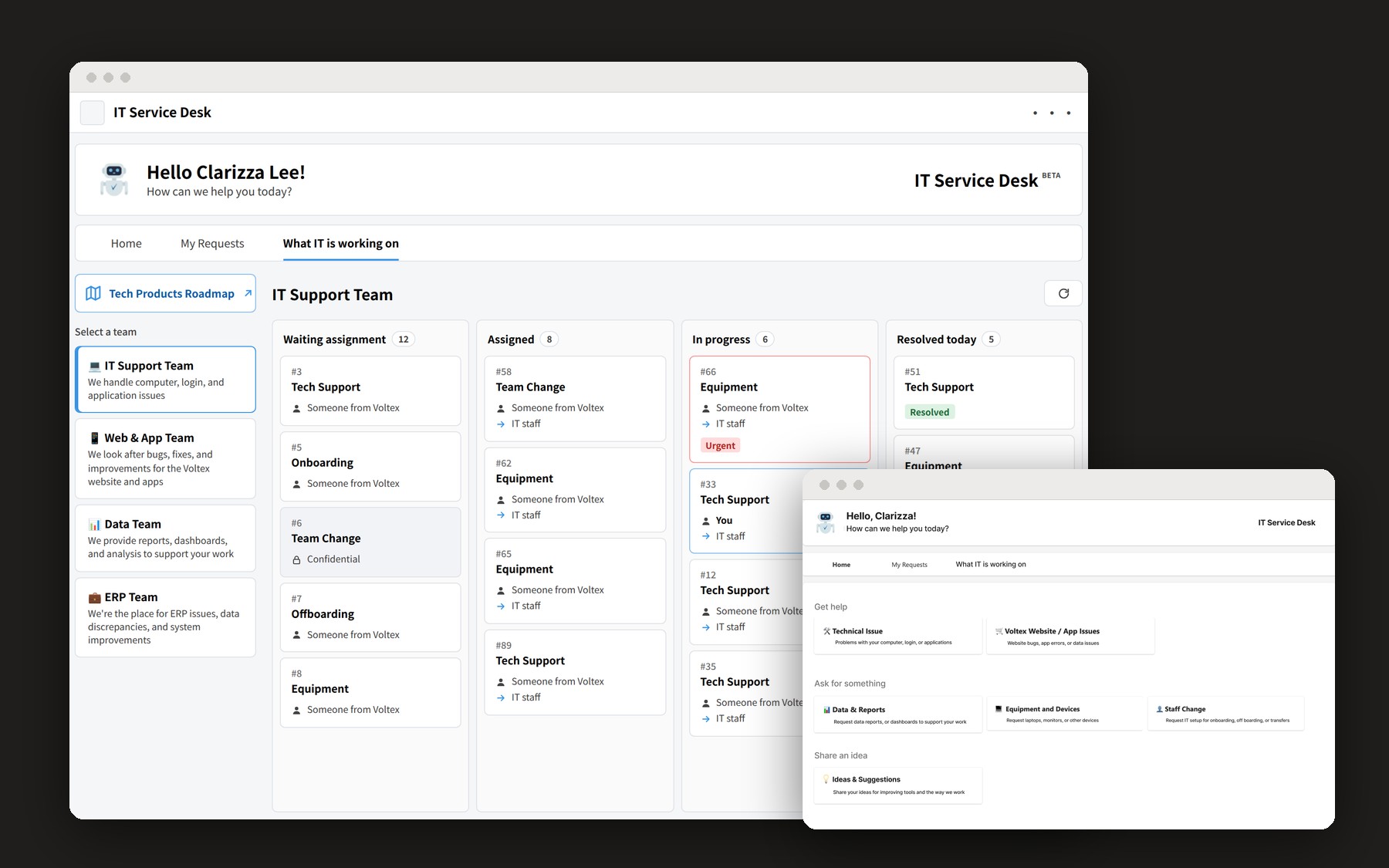
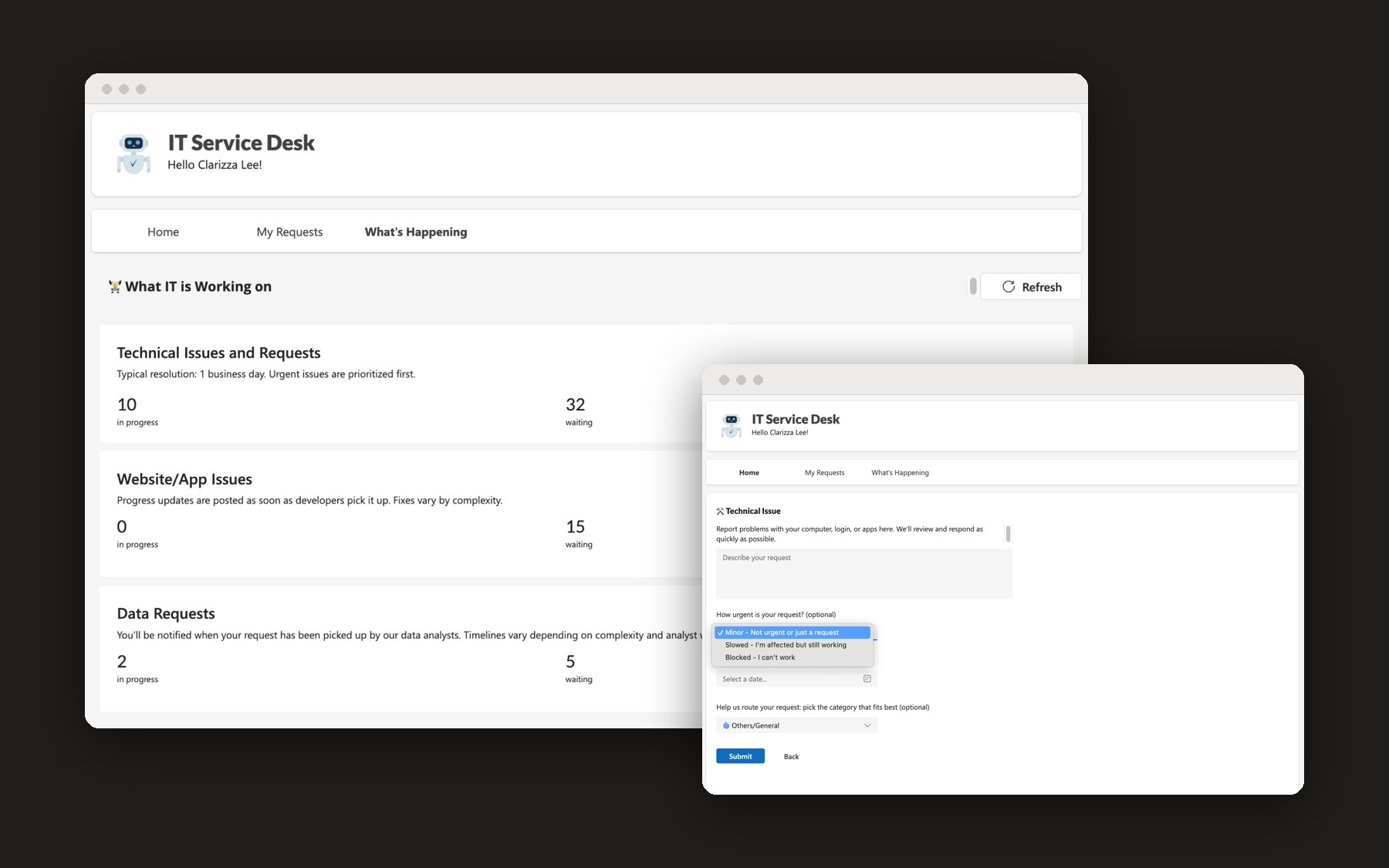
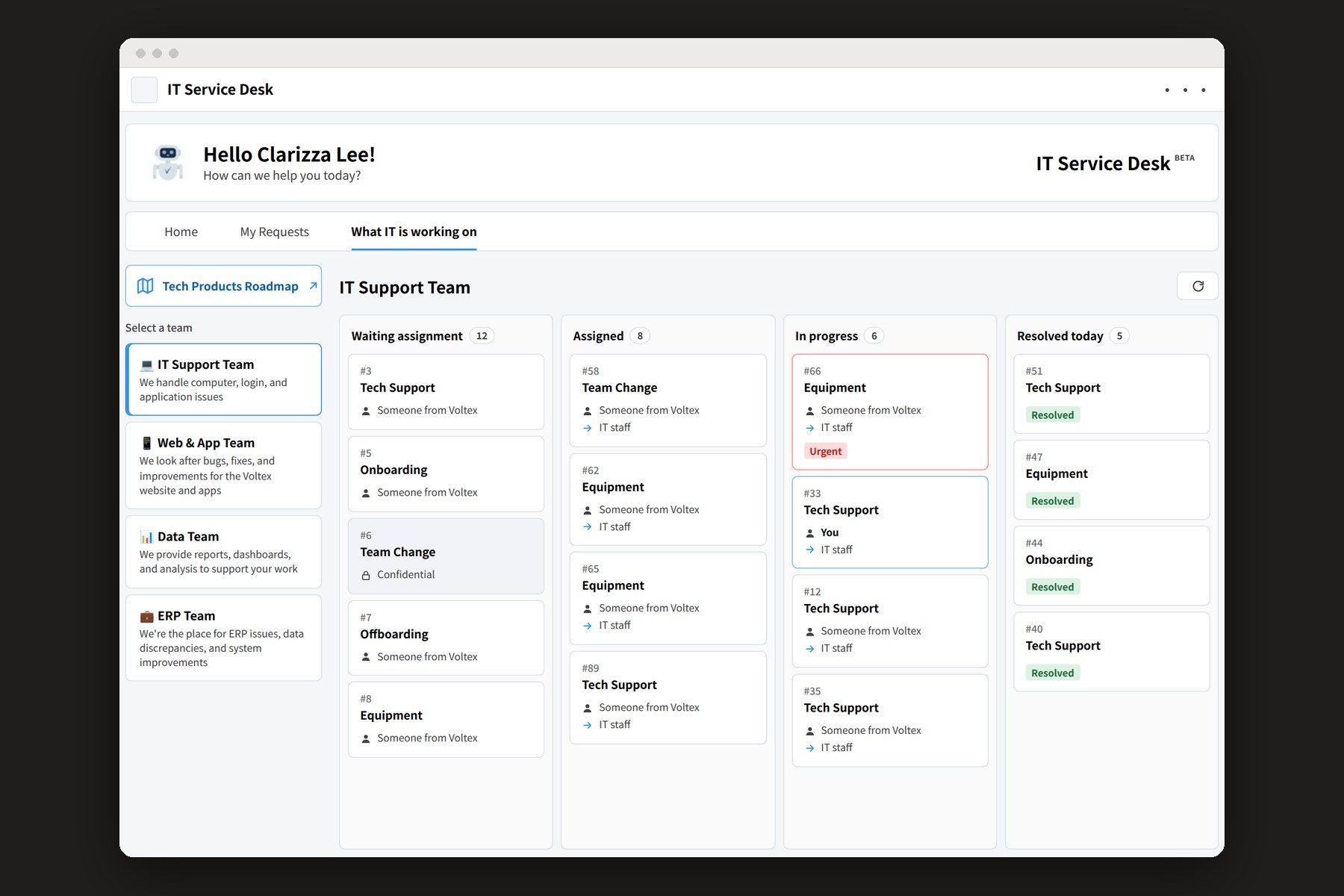
The IT Service Desk is a Teams app built in Power Apps, so it sits inside the tool staff already use all day. People log a request by category and follow its status through to completion. I designed the interface, working with a PM and a Microsoft developer who built it. Requests are grouped by what people want to do: get help, ask for something or share an idea. Forms ask in plain terms how the issue affects their work, from “I'm blocked, I can't do my work” to “just a heads-up”, so IT can prioritise without following up. A shared “What IT is working on” board shows the queue by team, from waiting assignment to resolved, so both sides see the same view.
Testing with the people who'd use it
Before rollout, I ran moderated remote sessions over Teams in August 2025 with five staff who had asked IT for help before, co-moderating with a product colleague. Testers explored the interface, submitted a request from a realistic scenario and then tracked it, rating their confidence from 1 to 5.
- Submitting worked: all 5 completed a request, with confidence between 3 and 5, and 4 found the interface simple
- Tracking didn't: 2 didn't know how to check status and 1 was blocked. Confidence dropped to 2 or 3
- Scope and categories were unclear: 3 weren't sure what the tool covered, and the categories didn't match how people described their problems
For anything they saw as critical, testers said they'd still message IT directly. The tool needed to show progress to change that habit.
What changed after testing
The report recommended stating the scope on the home screen, rebuilding the categories around how staff describe problems, sending updates when a request is accepted, in progress and done, and giving urgent issues a faster, more visible path.
The next build put these into practice. The home screen swapped IT's labels for plain language, dropped the emoji headers and italic descriptions that made it harder to scan, and opened with a greeting and a clear question: “How can we help you today?” Automated workflows built in Power Automate now message people in Teams as their request moves: when it's picked up, who their point of contact is, when its status changes and when IT leaves a comment.
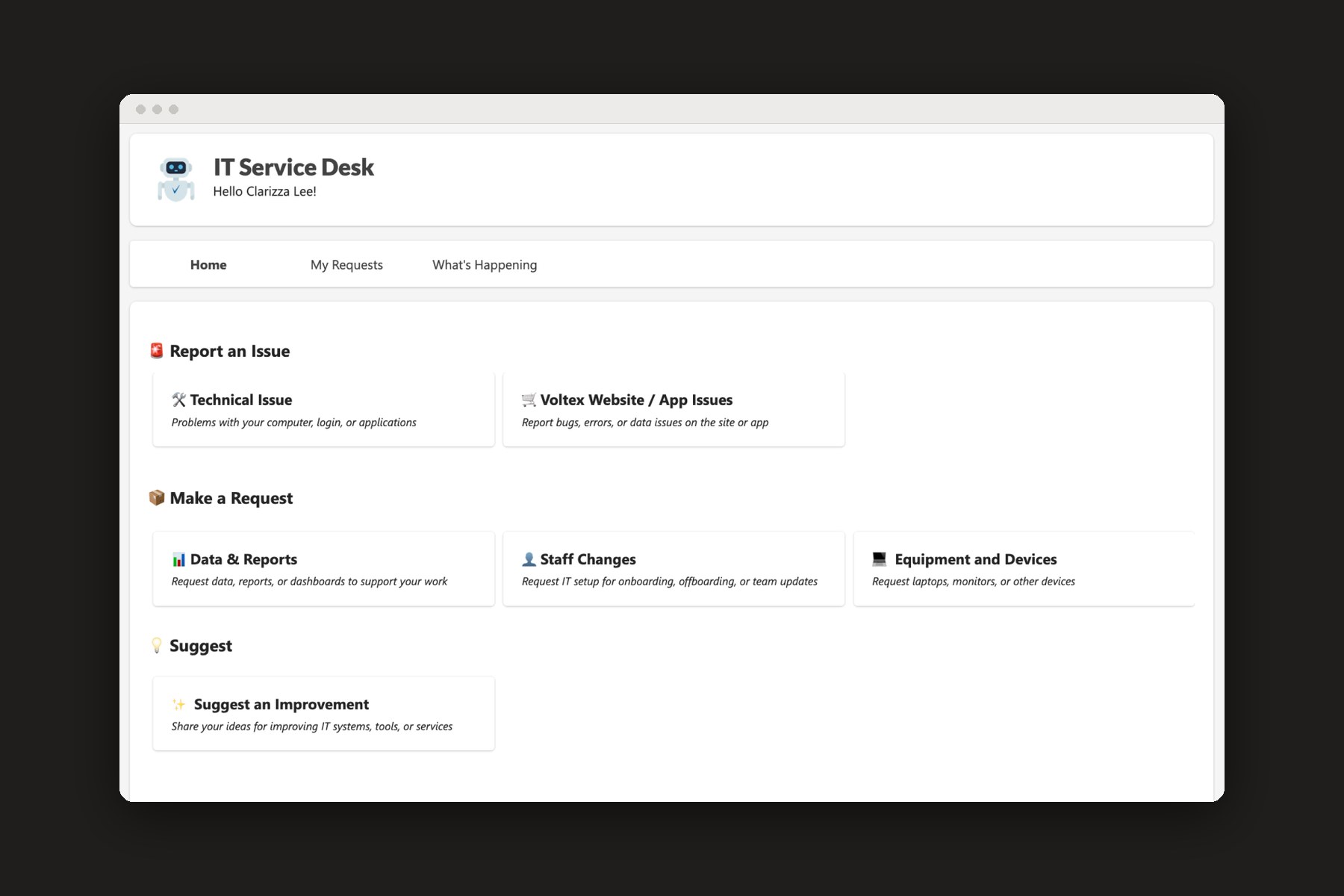
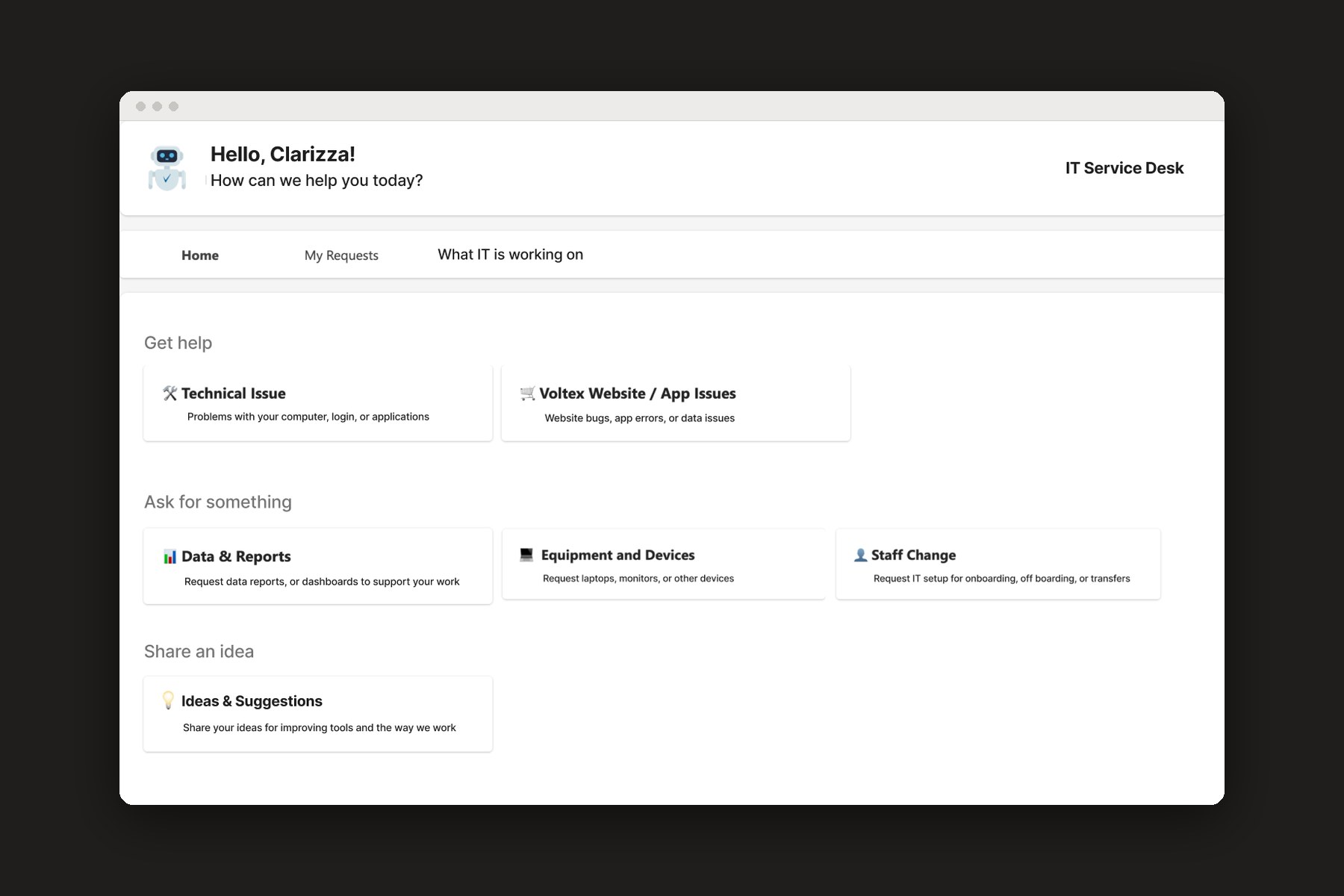
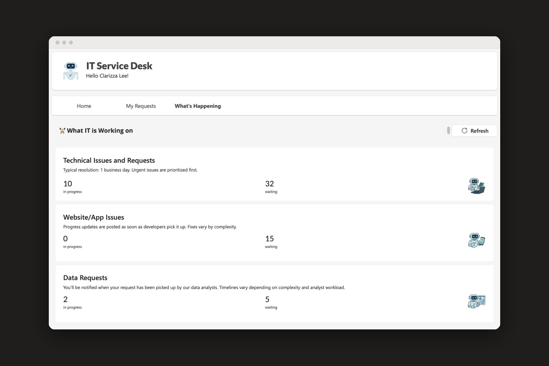
“What IT is working on” changed the most. The first build showed summary counts for each team. After testing, it became a live board by team and status, where people can find their own request, see who has it and see what's urgent. Card colours were reworked for contrast so status is easy to read.
Measuring after launch
To see whether the changes held up in real use, I designed a six-question CSAT survey, finalised in November 2025. Each question maps to a test finding: overall experience, ease of submitting, whether people felt informed about status, how it compared with messaging IT, what had improved, and how likely they were to use it again.
Delivering on a business goal
Operational excellence was one of the company's pillar business goals for 2025, and this work supported it in two ways. The research showed the ERP team how much speed was costing operations, which drove the performance work. The Service Desk gave every support request a clear path that both staff and IT could follow.
A relationship that carried forward
Months of sitting beside agents built trust with the customer support team. Because of that relationship, we brought them into the Ora Home design sprint, where a customer support representative joined the core team and shared what they heard from customers every day.
What I learned
Research can set engineering priorities. Everyone knew the ERP was slow, but ranked, observed evidence is what moved performance up the roadmap.
Watching people work shows what interviews miss. Sitting with staff showed workarounds nobody mentioned when asked. When the ERP froze, they restarted it, reopened every tab and messaged someone in IT by name. That last step led to the Service Desk.
A service has people on both sides. Fixing the experience for staff meant fixing how IT received their requests too. Designing for staff alone would have moved the problem to IT.
Research builds relationships. The trust we built with customer support lasted beyond this project and gave them a seat in the Ora Home sprint.
Tracking matters as much as submitting. Every tester could submit a request, but confidence fell when they tried to track it. People come back to a tool that keeps them informed.